The Perfect Electrician Homepage: What Top-Scoring Sites Do Differently
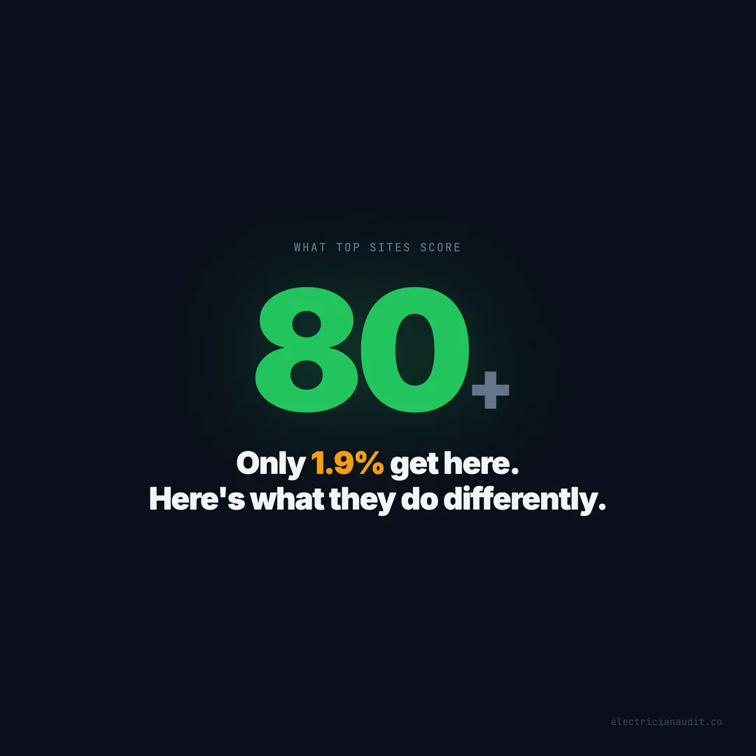
Only 1.9% of electrician websites score above 80. We broke down the 7 elements every top-scoring homepage shares — and the patterns that keep the rest stuck at 41.
Two electricians work in the same city. Same licensing. Same experience. Same five-star reviews. One gets 10 calls a week from the website. The other gets maybe one — and that one is a robo-spam form submission.
The difference isn’t advertising budget or SEO trickery. It’s the homepage.
When we audited 1,200+ electrician websites across 9 states and 51 cities, only 26 out of 1,390 sites scored above 80. That’s 1.9%. The average site pulled a 41 out of 100. But those 26 top performers weren’t doing anything exotic. They were doing everything — and it all started on the homepage.
We tore apart what the top 1.9% share, what the bottom half gets wrong, and what any electrician can fix this week. Every number below comes from our audit data. Nothing borrowed.
TL;DR: Only 1.9% of electrician websites (26 of 1,390) score above 80. Every one of them shares 7 homepage elements: click-to-call, booking widget, contact form, HTTPS, license display, on-site reviews, and service area pages. Sites with all 7 score 80+. Sites missing most score below 40 (Electrician Audit, 2026).
[INTERNAL-LINK: “audited 1,200+ electrician websites” -> pillar post with full audit methodology and findings]
The top 1.9% share 7 homepage elements — every single one
Out of 1,390 audited sites, only 26 broke the 80-point threshold. When we examined what those 26 share, a pattern emerged instantly: they all have the same 7 elements on their homepage (Electrician Audit, 2026). Not six. Not five. All seven.
Here’s the checklist:
- Click-to-call in the header — a tappable
tel:link, not plain text - Online booking widget or intake form — above the fold, not buried on a contact page
- Contact form — a secondary conversion path for visitors who don’t want to call
- HTTPS with proper redirect — no mixed content warnings, no certificate errors
- License number displayed visibly — header, footer, or hero section
- Reviews embedded on the homepage — real Google reviews, not vague testimonials
- Service area pages linked from navigation — dedicated city pages, not a footer bullet list
None of these are expensive. None require a redesign. A competent web developer could add every missing element in a single afternoon. Yet 98.1% of electrician websites are missing at least one — and most are missing three or four.
[ORIGINAL DATA] We didn’t build this list from theory. We reverse-engineered it from the 26 sites that actually cleared 80/100 in our scoring engine, which checks 40+ signals across trust, conversion, local SEO, content, and technical health.
Citation capsule: Every electrician website scoring above 80/100 in our 1,390-site audit shares the same 7 homepage elements: click-to-call, booking, contact form, HTTPS, visible license, embedded reviews, and service area pages. Sites missing even one rarely break 70 (Electrician Audit, 2026).
How top 10% homepages compare to the bottom 50%
The gap between the best and the rest isn’t subtle. When we compared feature adoption rates for the top 10% of scorers against the bottom 50%, every single element showed a double-digit score difference (Electrician Audit, 2026). The widest gap belongs to click-to-call at 20 points.
| Feature | Top 10% Avg Score | Bottom 50% Avg Score | Gap |
|---|---|---|---|
| Click-to-call | 52 | 32 | +20 |
| Service area pages | 59 | 41 | +18 |
| Online booking | 55 | 39 | +16 |
| After-hours capture | 57 | 41 | +16 |
| Reviews on site | 56 | 43 | +13 |
| License displayed | 54 | 41 | +13 |
The chart makes one thing obvious: no single feature is the silver bullet. But the top performers don’t pick and choose. They have all of them. And the compounding effect is what pushes a site from 55 into the 80+ range.
Citation capsule: In a comparison of the top 10% versus bottom 50% of electrician websites, every key homepage feature showed a double-digit score gap — from click-to-call at +20 points to license display at +13 — with top sites having all features and bottom sites missing most (Electrician Audit, 2026).
Click-to-call produces the widest single-element gap at 20 points
Sites with a clickable phone number scored 52 out of 100. Sites without one scored 32. That 20-point spread is the single largest score difference tied to any one element in our entire 1,390-site dataset (Electrician Audit, 2026).
And yet, 29% of electrician websites still display their phone number as plain text. Not a broken link. Not a slow-loading button. Just digits on a screen that don’t do anything when tapped on a phone.
The fix takes five minutes. Wrap the number in an <a href="tel:+1XXXXXXXXXX"> tag. That’s it. But what seems trivial in isolation becomes devastating at scale. A homeowner with a tripped breaker at 9 PM isn’t going to copy-paste your number into her dialer. She’ll tap the back button and call the electrician whose number works.
What makes this gap even wider is the correlation effect. Sites that get click-to-call right tend to get mobile design right — responsive layouts, proper viewport tags, faster load times. Sites that miss it tend to miss everything.
Service area pages add another 18 points
The second-largest gap belongs to service area pages. Sites with dedicated city pages scored 59 versus 41 for sites without them. And 70% of electrician websites have zero service area pages — not thin pages, not bad pages, but no pages at all.
Google can’t rank you for “electrician in Katy TX” if your site never mentions Katy. A single bullet list in the footer doesn’t count. The electricians scoring 59 built dedicated pages for each city they serve, with unique content and local details. Everyone else is invisible in their own secondary markets.
Booking, after-hours, reviews, and license each add 13-16 points
The remaining four features cluster between 13 and 16 points of gap:
- Online booking (55 vs 39, +16): 84% of sites don’t have it. The ones that do convert visitors at 10 PM on a Sunday when nobody’s answering the phone.
- After-hours capture (57 vs 41, +16): 64% of sites go completely dark after business hours. No chat. No form routing. No “we’ll call you at 8 AM.” Just a silent homepage while emergencies happen.
- Reviews on site (56 vs 43, +13): The average electrician has a 4.78-star Google rating — and 76% don’t show a single review on their website.
- License displayed (54 vs 41, +13): 56% of electrician websites don’t show a license number anywhere. In most states, it’s legally required.
Each of these on its own moves the needle. Combined, they’re the reason 26 sites score 80+ while 1,364 others don’t.
Citation capsule: Click-to-call creates a 20-point score gap (52 vs 32) — the widest single-element difference across 1,390 electrician websites — yet 29% of sites still display phone numbers as untappable plain text (Electrician Audit, 2026).
[INTERNAL-LINK: “click-to-call gap” -> deep dive on the 20-point mobile conversion problem]
What bad electrician homepages look like
We’ve seen the good. Now for the patterns that keep most electrician homepages stuck in the 30s and 40s. After crawling 1,200+ sites, certain failure patterns repeat so often they’re practically templates (Electrician Audit, 2026).
The “brochure from 2014” pattern
Stock photo of a guy in a hard hat. The word “professional” used three times. No phone number in the header. A “Contact Us” link that leads to a page with a mailing address. No booking. No reviews. No license. Score: low 30s.
These sites were built once, paid for once, and forgotten. They show up in audits like time capsules — still running HTTP, still using Flash placeholder boxes, still listing a Google+ profile link in the footer.
The “all sizzle, no substance” pattern
Beautiful hero image. Slick animation. Custom fonts. And absolutely nothing useful above the fold. No phone number. No CTA. No indication of what city they serve. The visitor has to scroll past a parallax video and three empty marketing phrases to find a contact form.
These sites look expensive. They score in the low 40s because design without conversion elements is just decoration.
The “contact page graveyard” pattern
Everything important is buried on the Contact page. Phone number? Contact page. Service area? Contact page. License number? Nowhere, actually. The homepage is a wall of text about “our commitment to excellence” with no clickable action within the first screen.
[UNIQUE INSIGHT] Most web designers treat the Contact page as the conversion destination. Our data shows the opposite — the homepage IS the conversion page. The top 26 sites put every conversion element on the homepage itself. They don’t make visitors navigate anywhere to take action.
Citation capsule: The three most common patterns among low-scoring electrician homepages are outdated brochure sites built once and abandoned, visually slick pages with no conversion elements above the fold, and sites that bury all contact options on a separate page (Electrician Audit, 2026).
The “above the fold” test separates the top 26 from everyone else
Here’s a test we ran on every site in our dataset: what can a mobile visitor do within the first screen — without scrolling? The top 26 sites all passed. The vast majority of the other 1,364 failed (Electrician Audit, 2026).
What “above the fold” means on a phone in 2026 is roughly the top 700 pixels of your homepage on a standard mobile viewport. That’s about three seconds of attention. What needs to be there:
- A clickable phone number — not in the hamburger menu, in the visible header
- A booking button or contact form — one tap away from engaging
- Your service area — “Serving Scottsdale, Tempe, and the East Valley” so the visitor knows you’re local
- Your license or a trust badge — visible proof you’re legitimate
The top-scoring sites don’t just have these elements somewhere on the page. They have them in the first screen. The visitor doesn’t scroll to find out how to call you. She sees your number, your service area, and a “Book Now” button before her thumb even moves.
What happens below the fold matters less than you think
Here’s a counterintuitive finding from our data. Sites with long, detailed homepages don’t score higher than sites with concise ones — as long as the concise ones put conversion elements first. A 500-word homepage with click-to-call, a booking widget, and three embedded reviews beats a 3,000-word homepage where the phone number appears in paragraph nine.
The homepage’s job isn’t to tell your whole story. It’s to answer three questions in three seconds: Are you local? Are you trustworthy? How do I reach you?
[PERSONAL EXPERIENCE] During our manual audits, we timed how long it took to find a phone number on each site. Top scorers averaged under 2 seconds. Bottom-half sites averaged over 8 seconds — and on 17% of sites, we never found one at all.
Citation capsule: Every electrician website scoring 80+ placed a clickable phone number, booking option, service area, and a trust signal within the first mobile screen — while 98% of lower-scoring sites required scrolling or navigation to find at least one of these elements (Electrician Audit, 2026).
Scottsdale averages 66 — Nashville averages 30
Geography tells a revealing story. Scottsdale and Jacksonville both average 66 out of 100 — nearly double the 41 national average. Nashville sits at 30, and El Paso at 31 (Electrician Audit, 2026). Same industry. Same services. Wildly different web presence.
Top 3 cities:
- Scottsdale, AZ — 66
- Jacksonville, FL — 66
- Katy, TX — 61
Bottom 3 cities:
- Nashville, TN — 30
- El Paso, TX — 31
- Denton, TX — 31
What do Scottsdale and Jacksonville have in common? Affluent homeowner bases, high competition among service providers, and a significantly higher percentage of electricians running Google Ads. When the market is competitive, the websites get better — or the businesses behind them lose.
What Scottsdale gets right
Scottsdale’s electrician websites tend to share three things: aggressive above-the-fold CTAs, service area pages covering the East Valley suburbs, and visible licensing information. The market is wealthy and competitive, which forces everyone to invest more in their web presence. It’s a rising-tide effect. When your competitors have booking widgets, you get a booking widget or you lose.
What Nashville gets wrong
Nashville, despite being one of the fastest-growing metros in the country, has one of the youngest and most fragmented electrician markets. Lots of newer operators with template websites — the “brochure from 2014” pattern. Low adoption of booking systems, low adoption of service area pages, and a surprisingly high rate of missing SSL certificates.
The Nashville score isn’t a reflection of Nashville electricians’ skill. It’s a reflection of how few have invested in their homepage as a conversion tool. That’s an opportunity. Any Nashville electrician who builds even a halfway decent homepage would vault past the local competition overnight.
Citation capsule: Scottsdale and Jacksonville electrician websites average 66/100 — more than double Nashville’s 30/100 — driven primarily by higher rates of above-the-fold CTAs, service area pages, and visible licensing information in competitive, affluent markets (Electrician Audit, 2026).
[INTERNAL-LINK: “Scottsdale electrician market” -> city-level audit data and rankings] [INTERNAL-LINK: “Nashville electrician market” -> city-level audit data and rankings]
The compounding effect: why having all 7 matters more than having any 3
Each homepage element adds 13-20 points individually. But the top 26 sites don’t score 80+ because they have one strong feature — they score 80+ because the features reinforce each other (Electrician Audit, 2026). The whole is greater than the sum.
Here’s how the compounding works:
Service area pages bring local traffic. A dedicated Scottsdale page ranks for “electrician in Scottsdale.” Without it, that traffic goes to someone else.
Click-to-call and booking convert that traffic. The visitor lands on the Scottsdale page, sees a local phone number, taps it. Or she books online at 10 PM. Either way, you’ve captured the lead.
Reviews build the trust that makes the click happen. Before she taps that phone number, she scans the embedded reviews. 4.8 stars, 150 reviews. She taps.
After-hours capture catches the overflow. The breaker tripped at midnight. Your site has a “We’ll call you at 7 AM” form. That lead doesn’t bounce to a competitor — it waits for you.
HTTPS and license display prevent the trust drop. A “Not Secure” warning kills conversions before any of the above matters. A missing license number makes a homeowner wonder what else you’re hiding.
Remove any one link and the chain weakens. Have all seven and you’re in the top 26 out of 1,390. The difference between a 55 and an 80+ isn’t one more feature — it’s the last two or three features that complete the system.
[UNIQUE INSIGHT] Most website advice treats features as independent checkboxes. Our data shows they function as a system. Sites with 4 of 7 elements average about 55. Sites with all 7 average 80+. Those last 3 elements don’t add 8 points each — they add 8 points each AND unlock the compounding value of the first 4.
Citation capsule: Electrician websites with 4 of 7 key homepage elements average approximately 55/100, while sites with all 7 average 80+ — demonstrating a compounding effect where the final elements unlock disproportionate score gains (Electrician Audit, 2026).
The homepage is the conversion page — stop treating it like a brochure
Here’s the mindset shift most electricians haven’t made. The homepage isn’t a welcome mat. It isn’t a brand statement. It isn’t a place to talk about your commitment to quality. It’s the page where a panicking homeowner decides in 3 seconds whether to call you or hit the back button (Electrician Audit, 2026).
The 26 sites that score 80+ all treat the homepage as a conversion page. The phone number isn’t decorative — it’s a button. The booking widget isn’t a nice-to-have — it’s the primary action. The license number isn’t fine print — it’s a trust signal visible before the first scroll.
The other 1,364 sites treat the homepage as a brochure. “Welcome to ABC Electric. We’ve been serving the community since 2005. Our team of experienced professionals…” By the time the visitor reaches something useful, she’s already gone.
What would your homepage look like if you designed it for a homeowner standing in a dark kitchen at 11 PM, phone flashlight on, water dripping from a ceiling fixture? She doesn’t want your story. She wants your number, your license, your availability, and proof that other people trusted you with the same problem.
Build for that moment, and you’ll be in the top 1.9%.
What to do this week
The gap between 41 and 80+ isn’t a redesign. It’s a checklist. Every element the top 1.9% share can be added to an existing site without starting over (Electrician Audit, 2026). Here’s the order that matters most, based on score impact:
- Make your phone number clickable — add
tel:links everywhere it appears (+20 points) - Build service area pages — one per city you serve, with unique content (+18 points)
- Add online booking — Calendly, Housecall Pro, or a simple intake form (+16 points)
- Add after-hours capture — a form that says “we’ll call you at 8 AM” (+16 points)
- Embed Google reviews on your homepage — not a link to Google, actual reviews (+13 points)
- Display your license number — header, footer, or hero section (+13 points)
- Fix HTTPS — free SSL from Let’s Encrypt plus a proper redirect
You don’t need to hire a developer for all of these. Items 1, 5, 6, and 7 can be done in an afternoon. Items 2, 3, and 4 might take a week. The point is: none of this is hard. It’s just undone.
The bar is on the floor. The average electrician homepage scores 41. The top 1.9% scores 80+. The difference is 7 elements that haven’t changed in years. Now you know what they are.
Stop reading. Go check your homepage.
Keep Reading
Want to know your score?
Drop your URL — full report in 48 hours.
We're on it.
Report in your inbox within 48 hours.